Why the bar format exists
Conventional 16:9 panels are optimized for watching, not for informing. A 55-inch landscape screen placed above a service counter or beside an elevator bank has a large vertical footprint it cannot justify: the top third is often above comfortable reading height, the bottom third is blocked by furniture, and the useful band of the display — the strip at eye level — is a fraction of its total area. Architects and AV consultants in Canada have responded to this geometry problem by specifying bar type LCDs: panels deliberately cut to ultra-wide aspect ratios so that the display's physical shape matches the shape of the message.
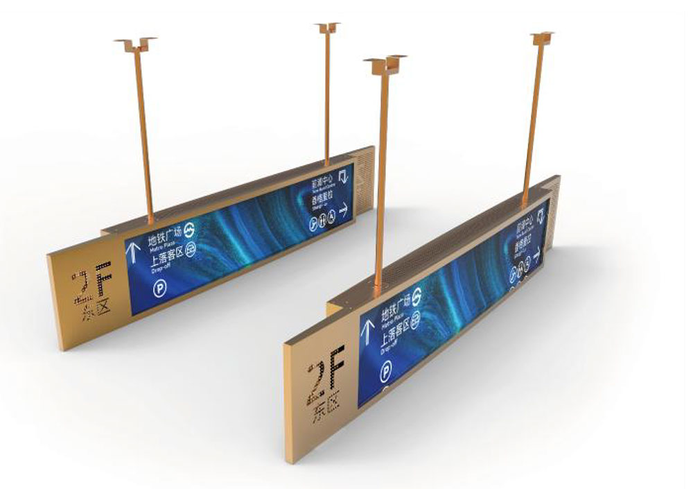
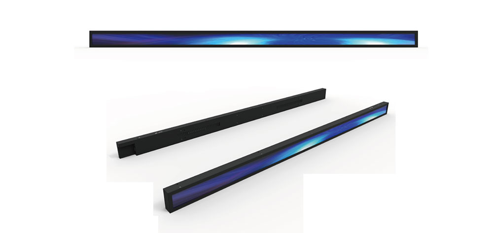
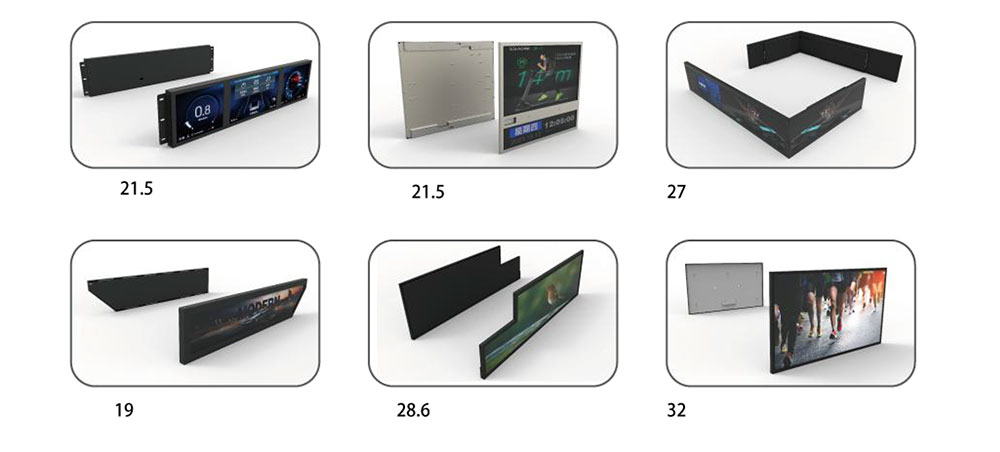
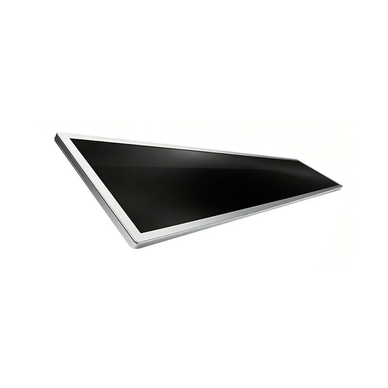
A bar type LCD (also called a stretched bar display, strip display, or ultra-wide signage panel) is an LCD module whose native aspect ratio ranges from roughly 3:1 to 5.5:1 or, in portrait variants, 1:3. These are not 16:9 panels with letterboxed content. The glass and the active area are manufactured to the finished ratio, which means the full addressable resolution is dedicated to the message, the bezel stays thin and proportional, the enclosure is shallow, and the installation can be recessed into a fascia, a bulkhead, an elevator lintel, or a millwork header without the visual weight of a television.

Anatomy of a stretched bar LCD
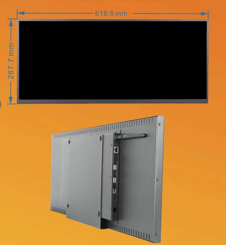
The optical stack is similar to a mainstream commercial display — edge-lit LED backlight, diffuser, polarizers, TFT array, color filter — but the mechanical and thermal constraints are different enough that general-purpose signage panels are a poor substitute. In a strip panel, the LED bars sit close to the light-guide edges relative to the small panel height, so hot spots and mura (cloudy luminance variation) are more visible than on a 16:9 panel. Reputable manufacturers address this with tighter light-guide tolerance, thicker diffusion, and per-unit gray-scale calibration. Two panels of the same model will never match perfectly, which is why bar displays used in a continuous row should be ordered as a matched batch and specified with factory luminance and color calibration reports.
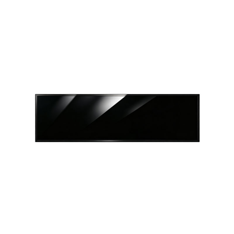
Because the enclosure is slim and the aspect ratio is extreme, heat density per unit of bezel length is high. A 1,000-nit bar panel dissipates most of its power in a narrow chassis with limited convection area. Passive fanless designs are feasible up to roughly 700–1,000 nits depending on panel area; above that, active cooling or a thermally bonded metal back plate is required. Fanless is strongly preferred in Canadian commercial interiors — fans draw dust into the light guide, become audible in quiet lobbies and libraries, and are the single most common mechanical failure point in installed signage.
Formats and resolution planning
| Approximate aspect ratio | Typical diagonals | Common native resolutions | Typical Canadian applications |
|---|---|---|---|
| 3.1:1 (28:9) | 28" – 48.5" | 1920 × 620, 3840 × 1240 | Lobby directories, queue-management headers, boardroom door cards |
| 3.6:1 (32:9) | 23.1" – 58" | 1920 × 540, 2880 × 810 | Shelf-edge retail media, service-counter headers, elevator lobbies |
| 4.1:1 (37:9) | 37" – 49.5" | 1920 × 470, 3840 × 940 | Transit platform headers, digital menu boards, wayfinding bands |
| 5.3:1 (16:3) | 16.4" – 43" | 1366 × 256, 1920 × 360 | Ticker bands, workstation status rails, reception signage |
| 1:3 to 1:4 (portrait) | 25" – 37" | 540 × 1920 | Column-mounted directories, pillar wraps, kiosk side panels |
Resolution planning matters more than it first appears. A 1920 × 540 panel is not a "small" display — text set at typical web sizes will render at a comfortable reading size only within a narrow band of viewing distances. As a rule of thumb for indoor signage, minimum cap height should be roughly 1/200 of the intended viewing distance in millimetres; a 540-pixel-tall canvas at 3 metres should treat 20–24 pixel text as the smallest acceptable body size. Content templates must be designed for the exact pixel canvas, not scaled from a 16:9 master, or the display will spend its service life showing cropped, compressed or letterboxed layouts.
Brightness: matching the panel to Canadian lighting conditions
Canada's commercial interiors span an unusually wide luminance range. A backlit grocery store aisle and a window-side concourse at Toronto Pearson or Vancouver's waterfront can differ by more than an order of magnitude in ambient illuminance, and a display sized for an office corridor will look washed-out beside a south-facing curtain wall.
- 400–500 nits: low-ambient interiors — corridors, elevator cabs, boardroom signage, library stacks.
- 700–1,000 nits: the workhorse range for retail, quick-service counters, transit platforms, hospital wayfinding. The right choice for most Canadian interior installations.
- 1,500–2,500 nits: atrium fascias, glazed lobbies, big-box retail with high-bay lighting, and any position where direct sun can fall on the face of the panel for part of the day.
- 2,500 nits and above: window-facing and semi-outdoor applications, typically requiring high-Tni panels, anti-reflective surface treatment, and active thermal management.
Raw nits are only half the story. Canadian specifiers should insist on anti-glare or anti-reflective surface treatment for any bar display mounted at or below eye level near glazing, because a 1,000-nit panel with a glossy face can be less readable than a 700-nit panel with a matte, low-haze coating. Optical bonding of the cover glass eliminates the internal air gap and the double-reflection that makes bar displays look hazy under downlights — a real issue beneath recessed pot lights, which are ubiquitous in Canadian commercial interiors.
Cold-climate engineering
Canada adds a requirement that most Asian and European panel designs do not address: reliable operation in low ambient temperatures. Bar displays are frequently installed in unconditioned or semi-conditioned spaces — parkades, transit shelters, loading docks, warehouse retail, unheated lobbies of older stock, and vestibules where indoor air temperatures can approach 5 °C in February. Standard commercial panels are typically rated from 0 °C to 50 °C and will show slow response, reduced contrast and, in some cases, permanent polarization damage if driven cold.
Three options exist, and the right one depends on the space:
- Wide-temperature panels rated to −20 °C or −30 °C for storage and 0 °C for operation, suitable where the space is cool but above freezing.
- Integrated heater glass or heater film with a thermostat, allowing cold start and operation below freezing. These draw meaningful extra power and need a dedicated supply circuit.
- Enclosures with climate control — insulated housings with thermostatically controlled heaters and filtered ventilation — for parkades, shelters and exterior vestibules.
Condensation is the companion problem. In spring and fall, a cold display carried into a warm, humid building will fog internally; sealed enclosures with desiccant or a properly vented design and an IP54 or better front rating avoid the slow moisture ingress that eventually clouds the light guide. Any bar display destined for a Canadian parkade or transit shelter should be specified with an explicit operating temperature range, a heater strategy, and an IP rating — not left to the assumption that "indoor" means "conditioned".
Bilingual requirements: designing for two languages from the first sketch
Public-facing signage in Canada is a language-planning problem before it is a technical one. In Quebec, the Charter of the French Language, as amended by Bill 96, requires that French be markedly predominant on commercial signage and advertising, including digital signage. In practice this means French must occupy a clearly larger or at least equally prominent position, and dynamic content cannot cycle through English-only frames for extended periods as a way of sidestepping predominance. Federal buildings — Service Canada centres, airports, ports, RCMP detachments, and federally regulated workplaces under the Official Languages Act — must present information in both official languages with equal quality and prominence.
Bar geometry is genuinely advantageous here. A 4:1 strip can be split into a left-hand French zone and a right-hand English zone without either language being visually subordinate, or run as a stacked pair of bars where each carries one language at identical size. Both approaches satisfy the spirit of equal prominence far more elegantly than a 16:9 screen cycling bilingual slides. Design considerations that recur in Canadian projects:
- French text runs 15–20 percent longer than English for the same content; zone widths must be sized on the French string, not the English one.
- Accented characters and the typographic conventions of Canadian French (spacing before colons and question marks) require font stacks and layout engines that handle them without justification artifacts.
- Emergency and regulatory messages must never appear in only one language, and must not depend on a scrolling band that a viewer might join mid-cycle.
- Content management systems should enforce paired-language publishing so that a French update cannot be pushed without an English counterpart, or vice versa.
Accessibility obligations
Accessibility law in Canada is layered: the Accessible Canada Act federally, the Accessibility for Ontarians with Disabilities Act and its Integrated Accessibility Standards Regulation in Ontario, the Accessibility for Manitobans Act, and Quebec's Act to secure handicapped persons in the exercise of their rights. None prescribes bar LCDs specifically, but all constrain how visual information may be delivered. A bar display carrying wayfinding, service information, transit data or emergency messaging in a public space should therefore be designed with:
- contrast ratios at or above WCAG 2.1 AA (4.5:1 for body text, 3:1 for large text), verified on the actual panel rather than on a desktop monitor;
- redundancy — tactile or printed equivalents for critical wayfinding, audible announcement where the display is the sole source of a message;
- no information conveyed by color alone, and captions for any video content;
- flicker-safe dimming. PWM backlight dimming below roughly 1 kHz can be uncomfortable and, for photosensitive viewers, problematic. Specify DC dimming or high-frequency PWM, and avoid very low duty cycles in dim corridors; and
- mounting heights that respect reach and sightline ranges in CSA B651, particularly for interactive bar displays used as directories or check-in points.
Electrical, structural and fire-code integration
Bar displays are small loads, but they are installed in large numbers and in places where code compliance is inspected. Canadian projects require certification to CSA/UL 62368-1 with a recognized mark (cUL, cULus, CSA) — provincial authorities including Ontario's ESA, Quebec's electrical inspection regime and Technical Safety BC enforce product approval at inspection, and an uncertified import will stop a project at occupancy. Power is 120 V, 60 Hz in most commercial installations, with 208 V or 347 V available in some buildings; multi-display runs should use a single 24 V DC distribution bus with a certified power supply rather than a wall wart per screen, both for inspection simplicity and for serviceability.
Three details cause avoidable site problems:
- Plenum-rated cabling. Where signal or power cables run through a return-air plenum — common in Canadian office towers — the National Fire Code and provincial electrical codes require suitable plenum-rated cable. Standard HDMI or USB cable pulled through a ceiling void is a common and expensive inspection finding.
- Seismic restraint. Suspended and wall-mounted displays in British Columbia, coastal Quebec and other higher-hazard zones must be braced in accordance with the National Building Code of Canada seismic provisions. A bar display on a slim bracket at 3 metres has a poor aspect ratio for overturning and needs a positive mechanical restraint, not friction alone.
- Means of egress. Displays must not project into exit paths below head height, and finishes in exits are subject to flame-spread limits. Recessed bar displays in corridor fascias should be detailed with the fire-rated assembly in mind from the start.
Integration with building systems
In modern Canadian commercial buildings, a bar display is rarely a standalone screen. The useful configurations connect in three directions. First, to the content management layer over the building's IP network, with the display given a static address, a scheduled on/off policy and remote diagnostics so that a dead panel in a 40-storey tower is discovered in software rather than by a tenant complaint. Second, to building automation via a control protocol for power state, temperature monitoring and fault reporting — panel temperature telemetry is a genuinely early indicator of a failing backlight or blocked ventilation. Third, to life-safety and mass-notification systems where the display is specified to carry emergency information; that integration must be engineered so the display fails in a safe state and never becomes the sole notification path.
Ambient-light-adaptive brightness is worth specifying for any installation near glazing or in spaces that dim in the evening. Fixed brightness in a dark lobby after hours is glare and wasted energy; adaptive dimming also extends backlight life and reduces panel temperature, which is the dominant aging factor.
A specifier's checklist
- Exact native resolution and the content template authored for that canvas.
- Brightness with a stated measurement condition, plus surface treatment (matte, low-haze, bonded glass).
- Operating and storage temperature range, heater option, IP rating, condensation strategy.
- Cooling method — fanless preferred — and expected backlight lifetime at the intended brightness.
- Certification mark acceptable to the provincial authority, and a certified DC power solution for multi-unit runs.
- Plenum-rated cabling, seismic restraint and mounting hardware rated for the panel's actual mass and cantilever.
- Bilingual publishing workflow in the CMS, with equal-prominence layout rules and French-first string sizing.
- Accessibility parameters: contrast verified on-panel, flicker-safe dimming, redundancy for critical messages.
- Batch calibration reports for any installation where two or more panels sit side by side.
- Remote monitoring, fault reporting, and a documented spare-panel strategy — stretched panels are not interchangeable with standard 16:9 stock, and a five-year-old bar model may be discontinued.
Conclusion
Bar type LCDs succeed in Canadian commercial buildings and public spaces because they solve a design problem that 16:9 panels cannot: they put information exactly where people look, in a proportion that matches the message, with an enclosure that disappears into architecture. But the format rewards careful specification. Brightness must be matched to a genuinely wide range of interior conditions, thermal design must account for Canadian cold and condensation, bilingual and accessibility obligations must be designed into the layout rather than retrofitted, and electrical, fire and seismic compliance must be settled before the first bracket is drilled. Get those right and a bar display becomes one of the most efficient communication surfaces in the building — a thin, quiet line of light that tells people where to go, what is happening, and what it costs.
KEYWORDS: bar type LCD display, stretched bar LCD Canada, high brightness LCD signage, ultra-wide commercial display, digital signage for public spaces